The following post is from Kurt Huber, Senior Art Director at TMA+Peritus.
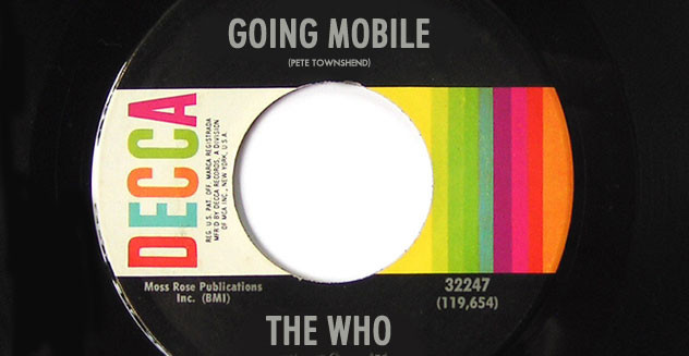
Day 27: The Who’s song, Going Mobile, is about the freedom we have to go anywhere and escape anything with automobiles and mobile homes. Mobile devices are also about freedom, but also our responsibilities to family, work, friends and others. They’re always with us, and we’re always available. For better, or for worse, these small devices have become the dominant way to surf the web, and this has meant a dramatic shift in how web designers, developers, marketers and writers create websites.
I'm Free. 1/3 of all web traffic is on smartphones and tablet devices and rising fast, while users are abandoning their traditional computers.
Getting in Tune. Google’s algorithm favors responsive websites. If your website was designed for the desktop era, or if you have separate desktop and mobile versions of your site, it’s time to move to a responsive website.
Who Are You? I Really Wanna Know. Mobile users need you to get to the point. Unnecessary copy needs to go away — now.
Pictures of Lily. Images need to be optimized, because fast load times are critical to mobile users. Retina users should also have higher resolution images available for their devices.
They Call Me the Seeker. A mobile site needs to be easy to navigate, links need to be large enough and separated enough to be easily pokeable with an index finger. Menus need to expand and collapse and/or move to the bottom to stay out of the way of the content.
These are just some of the considerations we use in our mobile-first approach to building websites. If you don’t have a responsive website by now, you need one very soon. I’ll let Pete Townshend wrap this up for me, “Mobile, mobile, mobile yeah!”