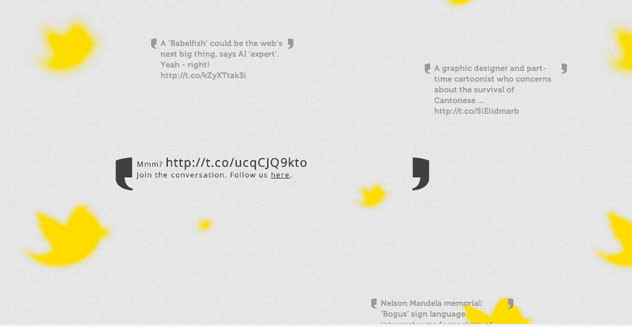
Parallax design is the illusion of depth created by layering images and setting them into motion with a user’s scrolling. The key to making this work is to have the background image move slowly while images in the foreground move at a more rapid pace, as they would when you’re looking at objects in space moving from a car window -— fence posts fly by and trees in the distant background move slowly. Parallax sites tend to use fewer but longer pages to maximize this experience.
Parallax actions can include:
- A fixed header that allows the rest of the page to scroll beneath it
- Varying scrolling within a section - eg: 2 or 3 columns of images can move in different directions at different speeds
- Separate images can come together, or assembled images can move apart
- Containers can empty or fill in parallax motion - eg: a glass of beer or soda
- Left to right action is also possible, arrows or buttons can be added to automate the movement
- Navigational guides can float in one position and can be used to help guide users. This is particularly helpful if there are very few or only one “page” to the parallax site
A few examples of parallax design in action:
http://livingword.co.uk
http://www.head2heart.us
http://www.smokeybones.com