Toole Design Group is the nation's leading engineering, planning, and landscape architecture firm specializing in multi-modal transportation. They have a reputation for developing cost-effective, practical solutions that move people efficiently, while improving the health and quality of life of the community. Toole Design is in the business of moving people in action – the same consumers who are on the move and want mobile-friendly sites.
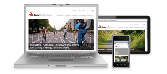
When faced with a website redesign, it was only natural to plan for the firm’s site to be accessed more frequently by their active clientele from a mobile or tablet devices than a desktop. “Based on the recent statistics that show a significant increase in mobile website viewing, we knew that responsive design was the way to go” states Amy Boehmer, Marketing Coordinator at Toole Design.
Responsive Website Design is an approach that allows websites to work from a single set of code that resizes itself to fit whatever screen a particular visitor is using, thereby eliminating the need for a separate mobile or tablet site. With a 55% increase in smartphone subscriptions alone in 2012, Responsive Website Design is quickly becoming an industry standard.
In addition to wanting a responsive designed website, there were other reasons they turned to TMA+Peritus as their web development partner.
Situation
The reasons why Toole Design wanted to redesign their website:
- They had a dated website that was 7 years old
- The website didn’t communicate the work they did or the progressive and modern aesthetic of their brand
- Their typical website visitor was active and mobile, and wasn’t always on a desktop and their existing site was not mobile friendly
- They were not able to make changes to their website themselves
Challenges
The challenges facing the website design were:
- Due to the nature of their business, the best way to show their work was through photography and images in a project portfolio. Navigation through the project portfolio on a desktop and tablet would need to be handled uniquely on mobile devices
- They did not want a content-heavy site and preferred a minimalist design
- They wanted website visitors to be able to view the entire website on mobile devices and tablets
Actions
The actions we took to address these challenges were:
- Designed the website using responsive design
- Used Drupal for the CMS (Content Management System)
Results
Our actions resulted in:
- A website that communicates the work they do as engineers and planners and aligns with their brand
- A modern and minimalist design that showcases their work through an engaging project portfolio
- A responsive website that resizes for desktop, tablet and smart phone viewing
- Integration with social media through sharing, Twitter, Facebook and LinkedIn
- A robust and flexible content management system that provides a quick and easy way for the Toole team to manage their website internally
And, congratulations to Toole Design Group for winning a Silver ADDY®* Award for Responsive Design!
The ADDY Awards represent the true spirit of creative excellence by recognizing all forms of advertising anywhere in the world. The local competition included hundreds of entries from Madison and Milwaukee and the surrounding areas. The Toole Website was awarded a Silver ADDY in the categories of Website Responsive Design.
*ADDY is a registered trademark of the American Advertising Federation.